Sweet Cheeks Q
Project Overview:
Located steps from Fenway Park, Sweet Cheeks Q is Boston’s home for unapologetically bold, Southern-style BBQ. Since opening in 2011, the restaurant has built a cult following with its campfire trays stacked with pork ribs, smoked brisket, and the now-legendary buttermilk biscuits slathered in honey butter.
With over a decade of loyal diners and brisket-fueled good times, Sweet Cheeks Q needed a visual refresh to match its growth—without losing the grit, warmth, or humor that made it a local icon.
Design Approach:
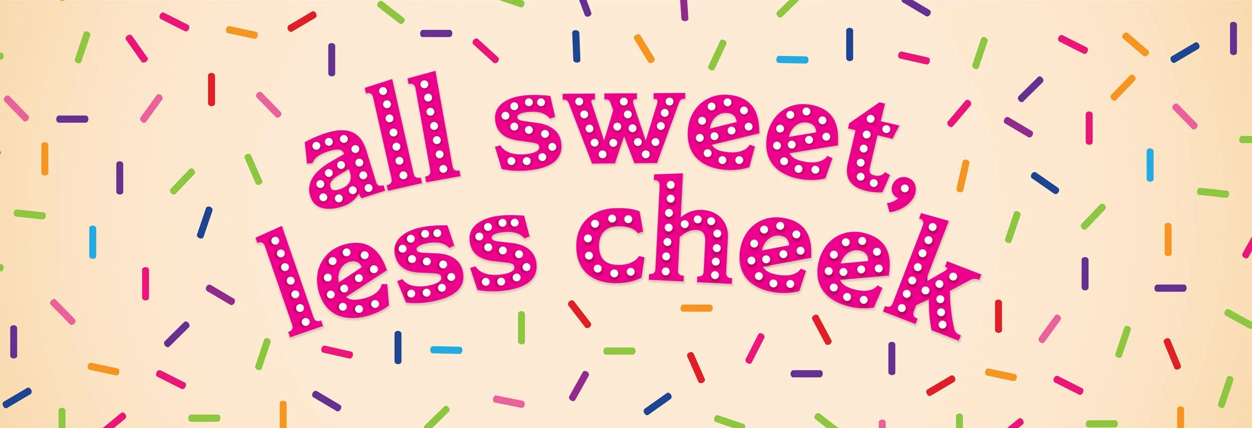
We began with a subtle yet meaningful refinement of the original logo—maintaining the stamped charm and signature hot pink “Q,” while improving legibility and balance. From there, we expanded the identity system into a full visual toolkit: expressive hand-drawn type, illustrated event marks, playful headlines, and a cheeky tone that’s equal parts rodeo and rock show.
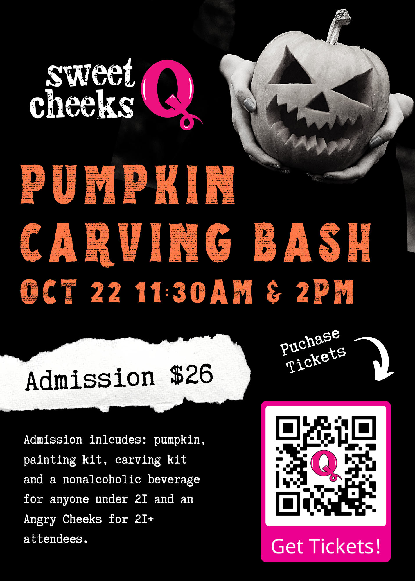
Menus, web visuals, and event campaigns were all given new life, with modular templates and brand language designed to scale as the team grew their programming. Special callouts like Slush Crush and Sweet Cheeks Forever got their own typographic treatments, while social and in-store collateral embraced color, texture, and joyful chaos.
Outcome:
The updated brand system gave Sweet Cheeks Q the flexibility to evolve, the boldness to grab attention, and the soul to stay true to its roots. With new diners arriving daily and longtime fans shouting out favorites by name, the refreshed identity serves up the same energy as a hot tray on a Friday night: bold, messy, memorable—and always made with heart.
Client
Big Heart Hospitality
Deliverables
Visual Identity Extension · Brand Collateral · Menu Design · Custom Illustration & Lettering · Social Media · Website Refresh
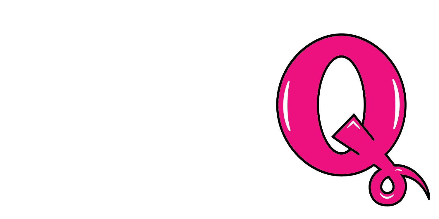
Previous Logomark
Revitalized Logomark

Favicon

Illustrations & Lettering